Motivation
"I start strong every January but lose track after two weeks. There's nothing that reminds me why I even started."

Hans J.


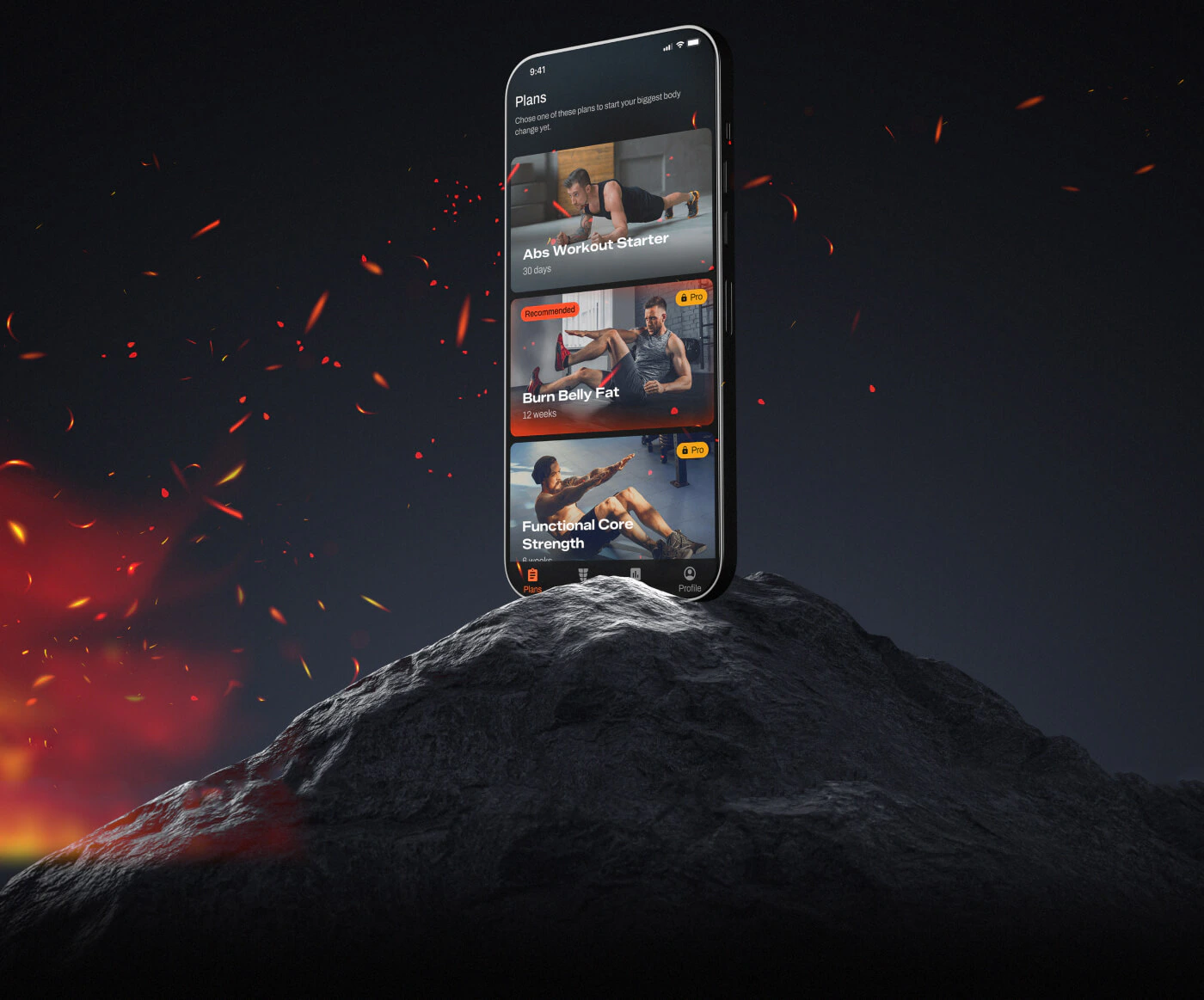
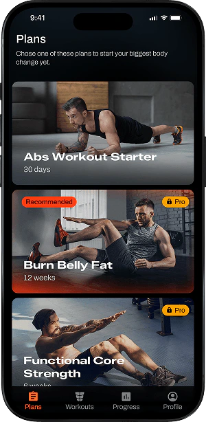
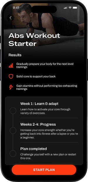
Burn is a fitness app designed for effective core training, providing structured abs workouts and guided exercise instructions.
Problem
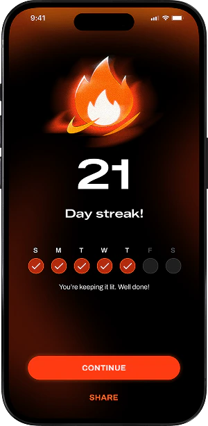
Most people don’t lack motivation—they lack support. Static plans and no real guidance make progress feel invisible, so even determined users give up.
Solution
Burn adapts to your level, schedule, and pace—giving you clear guidance and real progress tracking so it’s easier to stay consistent and feel results.
The UI/UX design process was focused on creating a simple and motivating experience for users looking to build stronger abs through guided workouts.

I conducted 1:1 user interviews to understand users’ needs, motivations, and pain points, helping inform design decisions.
Motivation
"I start strong every January but lose track after two weeks. There's nothing that reminds me why I even started."
Hans J.
Time
"I only have 10–15 minutes in the morning. I need something that doesn't waste my time with long intros or loading screens."

Ana P.
Customization
"Every app gives me the same beginner plan even after months of use. I want it to adapt to where I actually am."
Vladimir R.
Form & Guidance
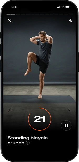
"I'm never sure if I'm doing the exercises correctly. A short animation would help."

Nicole S.
Progress
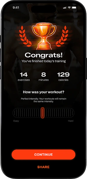
"I never know if I'm improving. I want to see numbers, streaks, something real."

Sarah B.
Consistency
"I forget to work out unless I get a push notification. But I hate apps that spam me — one smart reminder is enough."

Imane T.
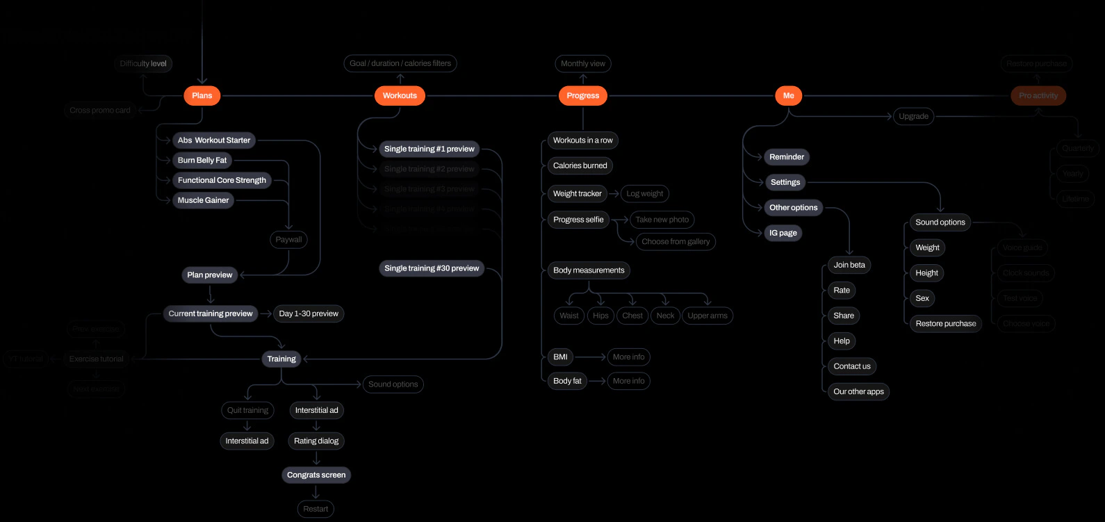
A clear information architecture makes key features easy to navigate.
Typography and color style keeps the experience focused and engaging.
Archivo
Zalando Sans
Expanded

#F89F00
Pro Content
#FF632A
Accent Light
#FE3B11
Accent
#B32B0E
Accent Dark
#000000
Primary
#161616
Pr. Light
#1E1F25
Pr. Light 2
100%
#FFFFFF
T. Primary
70%
#FFFFFF
T. Secondary
30%
#FFFFFF
T. Inactive
12%
#FFFFFF
Divider
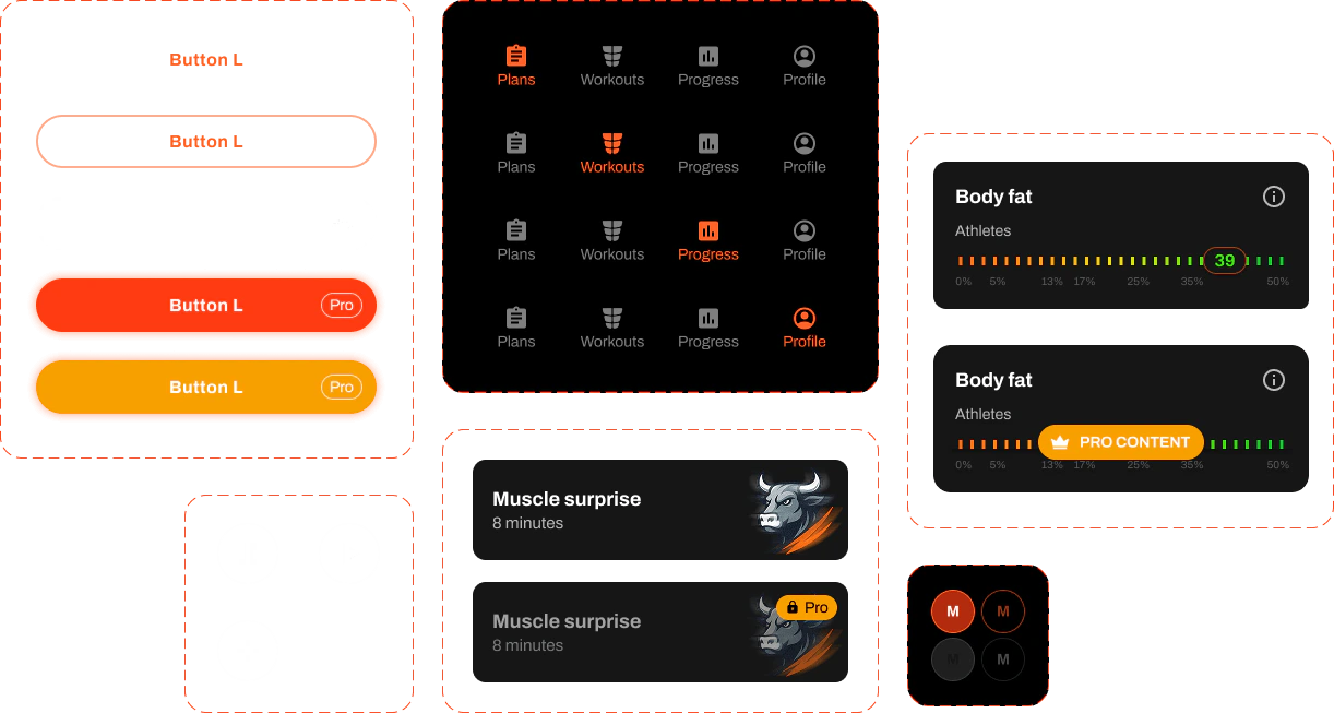
UI elements were designed for clarity, consistency, and ease of use.
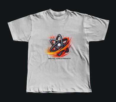
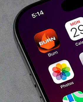
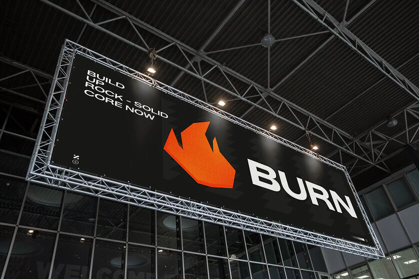
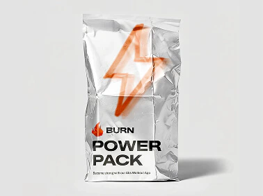
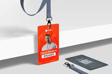
The brand identity reflects energy and motivation, supporting the app’s focus on effective and engaging workouts.

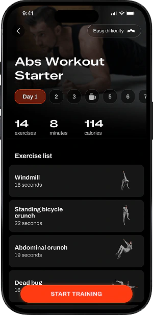
High-fidelity designs were created to visualize the final look and feel of the app before development.
The workout flow is built for speed—guiding users from selection to start in just a few simple, low-friction steps.